It’s time friends. It took 9 months of coordination, planning, excessive emailing and general indecisiveness to get to this point, but I’m happy to unveil an updated blog design.
Two years ago I began this blog as a means to share my love of food with a broader audience. Though I put many hours of work into the concept behind the site, selecting the original design took several minutes.
I’d hired a freelancer to help me through some nagging technical and design issues, and he offered a quick solution: buy a pre-made theme. Genius.


But I had one other suggestion for my friend the programmer: find a theme that hides the photography.
Hide it ….Bury it….Make it invisible.


A short while later I had the lovely Alison from Tiny Blue Orange tweak the design elements in the site to make the site more personal. I loved the look and feel. But eventually, all of the bells and whistles that came with the original theme seemed to detract from the content. Plus, the photography was still hiding in there….somewhere…..
While writing has always been my favorite part of publishing a blog, it wasn’t until recently that the photography became equally important. It was a steeper learning curve, but I’ve become more confident over time.

What this all came down to: I needed to minimize the clutter, get rid of the bells and whistles, but continue to make the site searchable and easy to navigate. And still keep the fun!
Change is hard to process. I know that some of you will miss the vibrant orange header, the image of the kids. Those little homepage image snippets that showed every blog post that I wrote since the beginning of time.
In some ways I will too.
But the kids are now years older than they were in the original header. And they’ll still be in every other blog post. With pores on full display given the new, larger, image size. How delightful!
Plus, you’ll have convenient navigation for all things NYC, all things travel, and all things cocktail. You’ll have direct and easy access to all of the CSA posts that I labored over last summer. You’ll see touches of hand-drawn illustration in the icons that now serve as category headings. And, wait for it….all of the picky eater fruit and vegetable challenge posts are in one place!

Remember those picky eater posts? Some of you may have noticed that they stopped abruptly, and for that, I apologize. It was during the course of the design process that I decided to make all of the picky eater posts accessible from a single page. And the number that I wanted to shoot for – 100 new foods – was slightly less than two years worth of posts. As such, I felt comfortable skipping one week…which led to another….then another again…you know where this is going. Momentum is critical and I learned a vital lesson about blogging – don’t. ever. stop.
I do plan to make up the remainder of the picky eater posts to get to an even 100. It’s a great number, an admirable number, and it took a lot of work – both mine and the kids’ – to get there.
And I may continue to tinker with the site a little here and there to make things just right. But what you today see is 99% complete. If we’ve done our job – that would be me, but more important, my talented web designers Wooden Spoons Kitchen and illustrator Maggie Prendergast – the site should come across as minimal, grown-up, content-focused and playful all at the same time.
Overall, the redesign was a fun, creative exercise…an excuse to carry a sketchpad and doodle ideas. Most important, it was a forced slim down for someone who leans toward the overdesigned. But like planning a wedding or having a baby, you look back at the effort in hindsight and thank the mighty heavens that it’s over.
I need a cocktail.
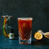
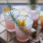
Thankfully I made myself two. Rhubarb key lime gin & tonics, a serendipitous match for the first icon that you’ll see on the site.

So onwards, upwards, let’s see where we can take this…


Congratulations on your redesign. Your new website is absolutely fabulous. A great showcase for your many talents that include cooking, writing and photography.
Thanks so much! Glad you like it, a labor of love xx
the new design is super sleek…Love it :). And your photos, as always, are stunning :). I recently just did some make-over as well in my blog..
Thank you so much, heading over to yours right now!
It’s perfect, Jessica! Whimsical and elegant. Thrilled for you!!!
Thank you so much Lily! You of all people can understand the effort involved xx
xx
Love the new design!
Thanks so much Gaby! xoxox
Wow! What a transformation! Very excited for you and look forward to all that is to come! Cheers
Thanks so much ML! I’m really so happy with it, such a nice change! xox
Congratulations…Any labor of love is just that…work that you love and love that you have to work at! Your efforts have not gone unnoticed by your readers. Love it!!
Thanks so much! It’s such a relief to be done and happy with the end product! And thanks so much your kind comments…
Love it! Finally had a chance to look through it all. So easy to navigate and your gorgeous photos really are highlighted:) You continue to inspire! Love you:)
Thanks so much Roon! love you too xox